
Alice Hudson Award - Gallery of Best Interactive Map Awardees
2025
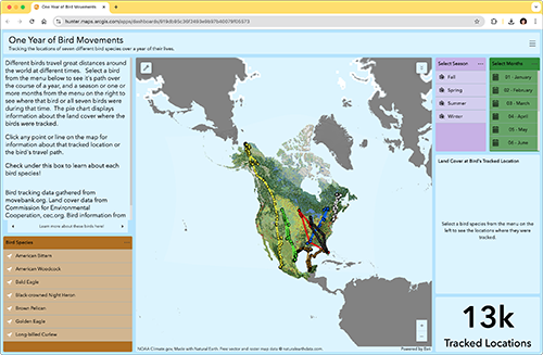
1 Year of Bird Movements
by Daniel Najjar
https://hunter.maps.arcgis.com/apps/dashboards/919db95c36f2493e9b97b40079f05573
This map displays the paths traveled by seven species of birds in North America across one year of their lives. I wanted to see how different birds travel across the continent at different times, and learn about what areas they could be found in for any given month. The map contains information about each different bird species, and displays the date, time, and land cover at each location at which they were tracked.
Intended Audience: People interested in birds and birdwatching.
Software Used: Arcgis Online Dashboard
Data Sources:
- American Bittern:
https://www.movebank.org/cms/webapp?gwt_fragment=page=studies,path=study43864485 - American Woodcock:
https://www.movebank.org/cms/webapp?gwt_fragment=page=studies,path=study12170798 - Bald Eagle:
https://www.movebank.org/cms/webapp?gwt_fragment=page=studies,path=study2943485 - Black-crowned Night Heron:
https://www.movebank.org/cms/webapp?gwt_fragment=page=studies,path=study2830157729 - Brown Pelican:
https://www.movebank.org/cms/webapp?gwt_fragment=page=studies,path=study296027617 - Golden Eagle:
https://www.movebank.org/cms/webapp?gwt_fragment=page=studies,path=study171287018 - Long-billed Curlew:
https://www.movebank.org/cms/webapp?gwt_fragment=page=studies,path=study1953194738 - Land Cover:
https://www.cec.org/north-american-environmental-atlas/land-cover-30m-2020/ - Bird information from allaboutbirds.org
2024
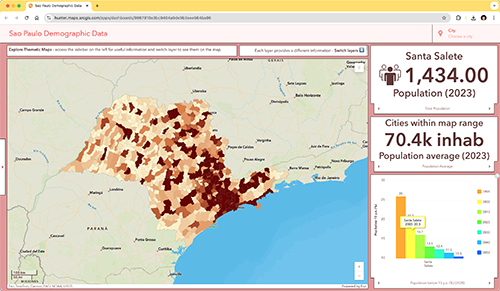
São Paulo Demographic Data
by
Pedro Oliveira
https://hunter.maps.arcgis.com/apps/dashboards/9867810e3bc9404a9de9b3eee564ba96
This map provides the user with several layers containing information about demographic information in São Paulo State in Brazil. The map has the goal of showing how population, population age, mortality, elderly population ratio, child mortality, and degree of urbanization are designed within the state. The user can compare cities and also have an idea of how each city is compared with its neighbors.
Intended Audience: policymakers, citizes, educators
Software Used: arcgis.com - dashboard plataform.
Data Sources: https://repositorio.seade.gov.br/dataset/demografia
2023
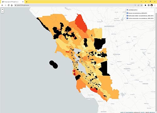
SF Bay Area Air Quality Trends, 2000-2015
by Jamie Bastian
https://jamo3524.github.io
This map examines how and where pollutant concentrations have changed in the nine-county San Francisco Bay Area between 2000 and 2015.
California is known for both high concentrations of, and efforts to reduce air pollutants. According to the American Lung Association, the worst four US cities, and six of the worst ten, for particle pollution are in California. Likewise, 10 of the worst 25 cities for ozone are in California. Air pollution has significant and uneven impacts to human health. Ozone and particulate matter pollution have been linked to respiratory harm (such as asthma), cardiovascular disease, and developmental harm (American Lung Association, 2022). Often, communities of lower socioeconomic status are left to bear many air pollution’s impacts. Those communities living adjacent to transportation infrastructure (highways, airports, and marine ports), heavy industry, or agricultural polluters, are more likely to be minorities, lower income, and have lower English proficiency (Havard et al, 2009).
Causes of air pollution in California include tailpipe emissions from combustion engines, fire, and esidential wood combustion for heat. Air pollution impacts are exacerbated by fog and wind from the Pacific Ocean, and mountain ranges that prevent air pollutants from dissipating. California’s historical land use and transportation policies contribute to air pollution as well. California is known for its sprawling, automobile-dependent suburbs throughout the state.
California has also taken steps to reduce air pollution. The California Air Resources Board (CARB) sets automobile emissions standards that are more stringent than those set by the US EPA. In addition, CARB sets the low-carbon fuel standard, which requires gasoline sold in the state to minimize certain pollutant levels.
The goal of this map is to determine how pollutant concentrations have changed in the San Francisco Bay Area from 2000 to 2015. This map tracks concentrations of three pollutants: ozone, particulate matter, and carbon monoxide, at the census tract level in the bay area. Ozone and particulate matter were chosen due to their impacts on human health, as outlined above. Sources of carbon monoxide emissions include tailpipe emissions and biomass burning. Carbon monoxide has impacts on human health and is an important contributor in the formation of ground-level ozone.
Intended Audience: Policy-makers, general public
Software Used: Folium (Python library), Jupyter notebooks, GitHub Desktop
Data Sources:
Air quality data: Center for Air, Climate, and Energy Solutions (CACES) Land Use Regression. This dataset estimates pollutant concentrations based on land use data, EPA estimates, and remotely sensed images. https://www.caces.us/data
Census tract boundaries: US Census TIGER shapefiles. https://www.census.gov/geographies/mapping-files/time-series/geo/tiger-line-file.html
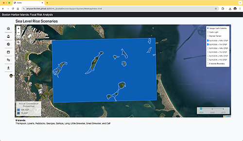
Boston Harbor Islands: Focal Resource Risk Analysis SDSS
by Amy Carrillo
https://amycarrillo164.github.io/BOHA_SpatialDecisionSupportSystem/WebApp/index.html
This web page is the host site for a navigable and accessible web-based dashboard that visualizes areas of high-risk at Boston Harbor Islands. The islands selected for the map and analysis are Thompson, Lovells, Peddocks, Georges, Gallops, Long, Little Brewster, Great Brewster, and Calf. The on-going goal of the project is to create a Spatial Decision Support System (SDSS) that can help park managers/stakeholders make decisions on which high risk areas to select for future collaborative climate adaptation efforts.
Intended Audience: Boston Harbor Islands park managers & stakeholders
Software Used: I created the webmap using leaflet. I edited the data beforehand using ArcGIS Pro.
Data Sources: Data I created for the focal risk analysis is available on my github (https://github.com/amycarrillo164/BOHA_SpatialDecisionSupportSystem/tree/main/WebApp/geojson_files). The other data I used, built off, and/or converted from raster to vector is also available on my github (folders: WebApp/geojson_files, WebApp/js_datafiles) and is cited in the Data/Methods section.
2022
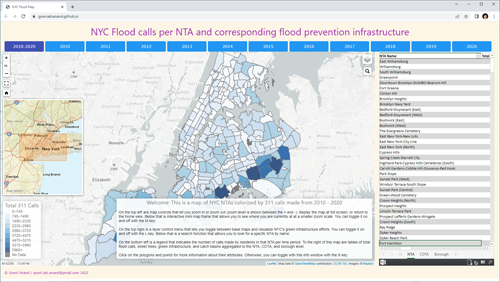
311 flood calls in NYC and corresponding flooding prevention infrastructure
by
Gowri Anand
https://gowriabianand.github.io/
As one of the most populated cities in the world with some of the countryʼs most antiquated infrastructure, New York City has been and will increasingly be vulnerable to countless number of flood related incidents with climate change effects rapidly taking effect. This is particularly true for certain parts of NYC that are closer to the coast or reside in areas that have poor stormwater infrastructure. The purpose of this project is to display and contrast the flood related service calls made by residents to 311 (per year and overall) and the flooding prevention infrastructure that the city has implemented, such as wetland street trees. The scope of this project focuses on NYC 311 calls from 2010 to 2020, and the NYC 2015 street tree census thus far. It is important to see if and which areas are at particular risk or are already struggling so that priority can go towards these places and mitigate the effects of flooding as much as possible. Essentially, the goal is to identify which neighborhoods have the most flooding within the past 11 years and if and how these neighborhoods have stayed consistent over time.
Intended Audience: NYC residents
Software Used: PostgreSQL, Microsoft Visual Studio Code
Data Sources: For this project I will be using 311 calls data from 2010 to the end of Dec 2020 on NYC Open Data as well as NTA shapefiles which is also located from NYC Open Data. For the 311 calls, I have filtered for the following descriptor types: Street Flooding (SJ), Sewer Backup (Use Comments) (SA), Highway Flooding (SH), Manhole Cover Missing (Emergency) (SA3), Manhole Overflow (Use Comments) (SA1), Possible Water Main Break (Use Comments) (WA1), Catch Basin Clogged/Flooding (Use Comments) (SC), and Excessive Water in Basement (WEFB). For the street trees, I will be using the NYC 2015 Street Tree Census and have filtered for alive trees that are considered wetland tree species.
2021
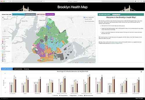
The Brooklyn Health Map
by
Sheena Philogene
http://sunsp.net/demo/p/
This map was initially developed to answer the question, 'what areas of Brooklyn have a high prevalence of cancer cases?' and to inform the development of culturally competent and targeted healthcare outreach initiatives. As the map developed its purpose developed, since cancer is so closely linked to various health behaviors (e.g., smoking, drinking, obesity, etc.) and comorbidities (e.g., diabetes, heart disease, and kidney disease). As such, the purpose of this map is to provide local level information about a wide array of health conditions, including cancer and some of the commonly associated comorbidities and behaviors that may lead to cancer.
Intended Audience: This map is intended for a broad Brooklyn-based audience, which may include researchers, medical professionals, community organizations interested in developing community targeted health interventions, and individuals who are interested in community health but who don’t necessarily work in healthcare.
Software Used: This map was created using Visual Studio Code, and was built using JavaScript, CSS, and HTML. ArcGIS Pro was used to geocode data and export GeoJSON files. Microsoft Excel was used to calculate zip code level estimates of language data, using HUD-USPS 'ZIP-TRACT' ZIP Code Crosswalk ratios
Data Sources:
- PLACES: Local Data for Better Health, Census Tract Data 2020 (https://chronicdata.cdc.gov/500-Cities-Places/PLACES-Local-Data-for-Better-Health-Census-Tract-D/cwsq-ngmh)
- 2014 American Community Survey: Language Spoken At Home by Ability to Speak English for the Population 5 years and Over - TableID: B16001
(https://data.census.gov/cedsci/table?q=language&g=0500000US36047.140000&tid=ACSST5Y2014.S1601&moe=false&hidePreview=true) - HUD-USPS 'ZIP-TRACT' ZIP Code Crosswalk [First Quarter 2021]
(https://www.huduser.gov/portal/datasets/usps_crosswalk.html)
2020
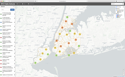
New York City Public School Explorer
by Horia Popa
https://xtrudio.github.io/nyc_schools
The web map application provides information regarding public schools in New York City.
Intended Audience: Parents and students interested in the public schools in New York City.
Software Used: Visual Studio Code, Adobe Photoshop, Adobe Illustrator
Data Sources: NYC Open Data
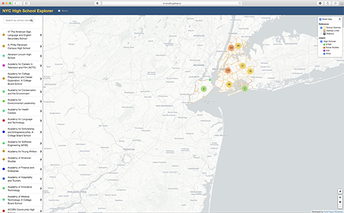
New York City High School Explorer
by Horia Popa
https://xtrudio.github.io/nyc_highschools
The web mapping application aims to help parents and students in New York City chose a high school. It provides comprehensive information as well as links to their websites and the respective DOE snap-shot pages.
Intended Audience: New York City middle school students and their parents.
Software Used: Visual Studio Code, Adobe Photoshop, Adobe Illustrator
Data Sources: NYC Open Data
2019
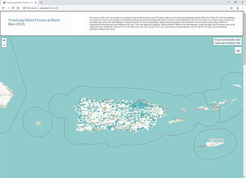
Visualizing School Closures in Puerto Rico (2019)
by Paul Bendernagel
http://sunsp.net/demo/B/
The objective of this stdy was to utilize tools contained within the free and open source GIS stack to analyze school closure and performance data for Puerto Rico. Puerto Rico has been embarking on an ambitious school closure program to consolidate teaching resources and has increased the number of schools closed dramatically in the 2018-2019 school year. Using a variety of spatial and non-spatial data sources, this study attempted to examine the trends in school closure patterns, identify potential inequities in the distribution of school closures, and develop a WebGIS to disseminate the information and data developed in this study. Policy makers, researchers, and citizens are hindered by the lack of publicly available data pertaining to these far-reaching programs being implemented in Puerto Rico. Creating open data portals and Web GISs enables individuals to not only find out how these programs may be affecting them, but to critically understand, evaluate, and potentially fight back against legislation that could adversely be affecting them or their families and communities.
This webGIS provides an inherently simplified perspective on a complex socio-political issue. The utilization of the Social Vulnerability Index serves as a proxy for the wide range of socioeconomic, demographic, and environmental variables that can interact to marginalize populations on the Island. The five-mile buffer layers created for the open elementary schools, middle schools, and high schools function as a preliminary screening to find locations in which students may be subjected to disproportionately lengthy and disruptive school transfers. The complexity of the analysis and breadth of data included in this map could be scaled up and built upon in future iterations of development. The primary goal in building this application was to demonstrate a viability of a completely open-source methodology that utilizes only open-source data to empower citizens to collect, analyze and visualize complex and contentious spatial problems facing their communities.
Intended Audience: citizens, policy makers, educators, activists, and media
Software Used: QGIS, PostGIS, Leaflet.JS, MS Visual Code Studio
Data Sources:
- School Closure Data, point locations, and facility data: Center For Puerto Rican Studies Hunter College Data Center: http://www.arcgis.com/home/webmap/viewer.html?webmap=e72119d2f9d347899cc2d221d4bec45a&extent=-70.6398,15.9789,-62.5263,20.3927
- Social Vulnerability Index: Center For Disease Control https://svi.cdc.gov/data-and-toolsdownload.html
- Buffer boundaries were manually created in QGIS and exported as GeoJSON files