Lab 02: Raster Analysis
Map Algebra and Spatial Analyst
Lab: Raster Analysis: Distance, Density, Statistical Analysis
I. Objectives
For this week, we learn raster analysis. Raster data models are widely used for environmental analysis based on satellite images or aerial photos. Map algebra defines a set of syntax for combining raster layers by applying mathematical operations and analytical functions to create new data. Map algebra operates on local, focal, zonal, or global functions. In a map algebra expression, the operators are a combination of mathematical, logical, or Boolean operators, and spatial analysis functions (slope, shortest path, spline, and so on), and the operands are spatial data and numbers.
In the lab, we will use various Spatial Analyst tools to conduct raster analysis. Specific tasks include distance analysis, density surface, and statistics at local, focal, and zonal levels.
II. Lab Tasks and Requirements
Download the data. Note that the lab tutorials were developed using an older version of ArcMap or ArcGIS Pro so some screenshots of the tools may be different from your ArcGIS Pro version. Please be flexible and find the corresponding new tools and parameters in ArcGIS Pro. Remember to ask if you cannot get around the different interfaces.
TASK 1 DISTANCE AND DENSITY ANALYSIS
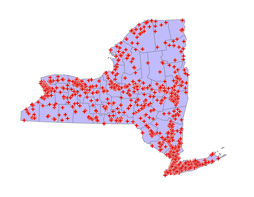
Create a permanent point feature class from the NYS health facilities table using geographic coordinates, i.e., not a temporary layer in your map, but one feature class in your geodatabase visible in Catalog.
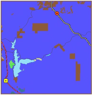
Choose an appropriate map projection for the New York State. Also add the US counties layer but use Definition Query to exclude counties not in New York (Definition Query is located in Layer Properties ). It should look like this.
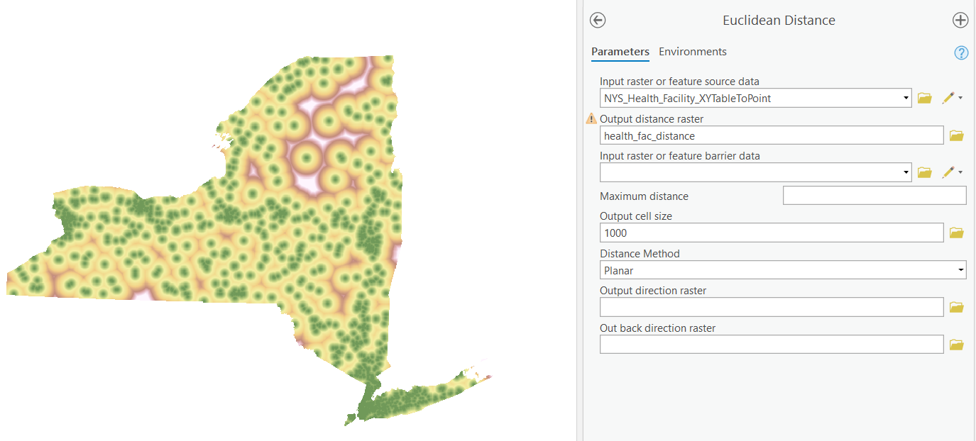
Now, create a Euclidean distance surface from those health facilities. Make sure the resultant distance layer exactly aligns with the state boundary. To achieve this, we need to have a separate NYS layer as mask in the Environments.
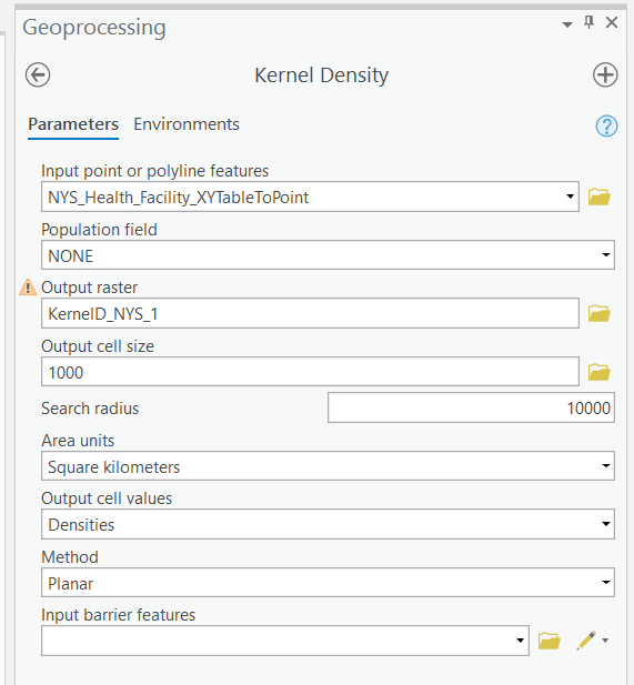
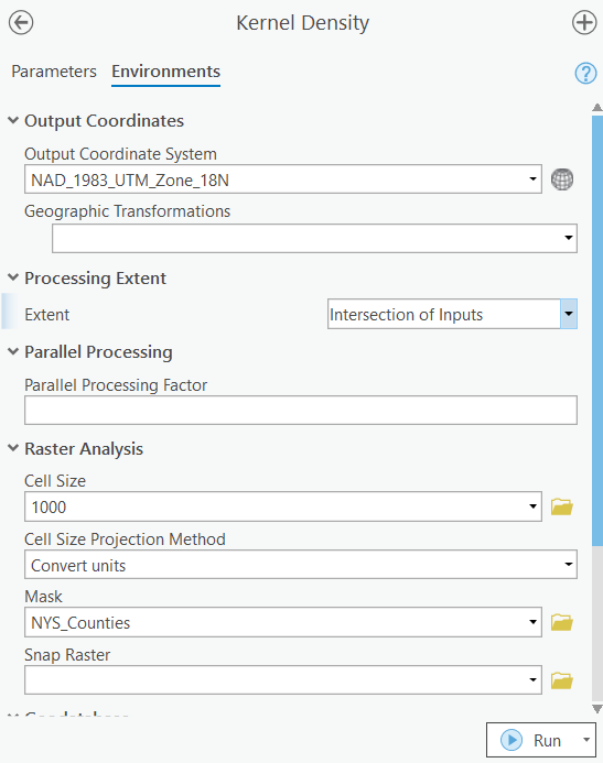
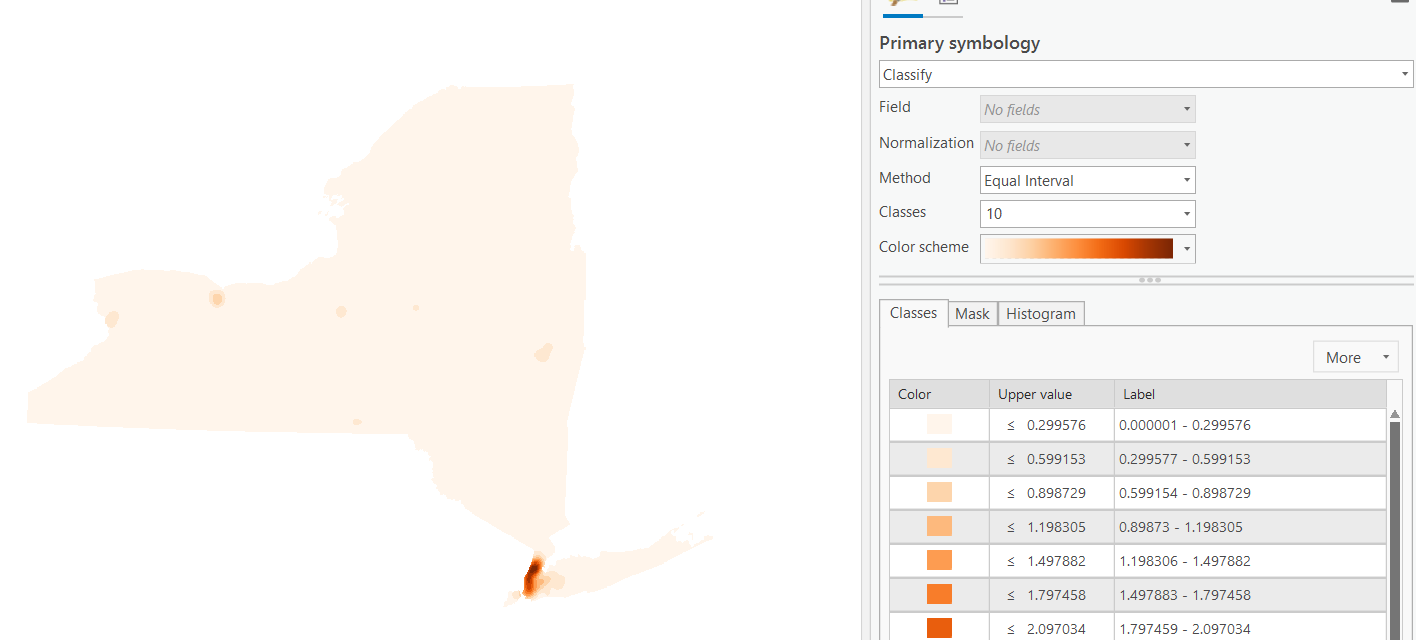
Similarly, conduct a kernel density analysis and calculate the density of those facilities. It is quite obvious that NYC has the highest density of health facilities. In general data analytics, this type of visualization is often referred as “heat maps”.
TASK 2 Summary Statistics and Reclassification
Copy the NYS Land Cover Data (NLCD) to your file Geodatabase using the Copy Raster tool. The data was derived from the NLCD 2016. The downloaded data contain metadata, but you can also read the metadata online
Note that raster data are big and processing raster data can be very slow. I used the entire NYS for demonstration. You can clip NYC + Long Island for the assignment using the Clip Raster tool.
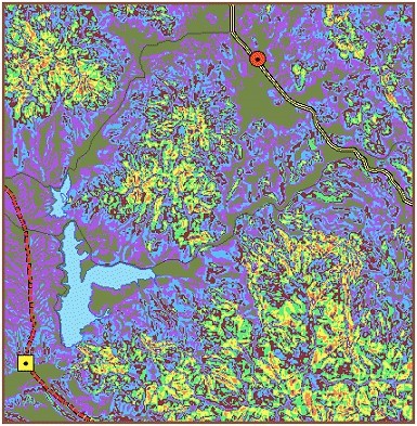
First, we can run different types of spatial analyst tools to derive statistics on the raster data. Here we just run a simple one and see what is the area of each type of land cover/land use. If we run this across multiple years, their changes will be clear. Read the metadata and see what land cover type each value is in the table.
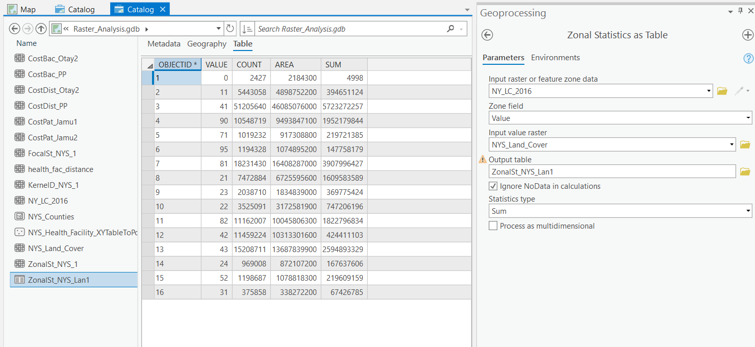
Why do we use “Zonal” statistical tool to do the work?
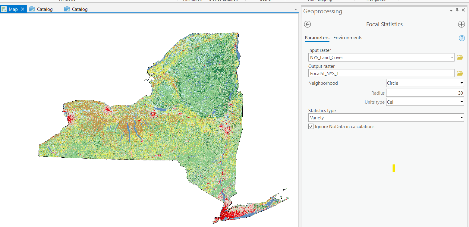
We also want to know the variety or diversity of land use/land cover around every single pixel. Run the focal statistics tool to see the results.
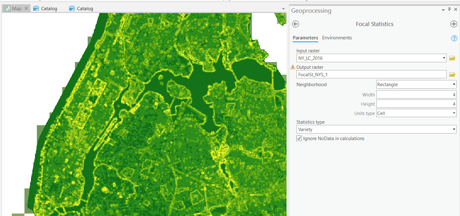
What does the result show? Can you think of an application of such variety statistics?
Note that we normally should use bigger focal neighborhoods in real-world applications. The lab is just for illustration purposes. Using bigger neighborhoods will significantly increase the time to run the tool due to the size of the raster data.
TASK 3 Map Algebra and Suitability Modeler
With results from raster data analysis like the density of health facilities and the diversity of land cover/land use, we can apply Map Algebra to conduct further analysis.
For example, suppose we are helping find a new location for a nursing home, the only two factors being considered are the distance to the nearest health facility and the diversity of land cover (of course, real-world applications will consider much more factors).
We will first rescale the data to the same range such as [0, 100], so that they can be compared meaningfully.
Then, we will decide the importance of each factor. For example, the distance is 80% important while the land cover diversity is 20%.
Now, we can use Map Algebra (Raster Calculator in ArcGIS Pro) to integrate the two raster datasets to derive a new map, which will show the scores or suitability of each location.
To facilitate such works, ArcGIS Pro integrates some of the key steps of this process and produces a tool called “Suitability Modeler”. While no works need to be done now, you are encouraged to explore the tool on ArcGIS.com. We will come back on this later. Raster analysis really provides all the necessary data for the suitability analysis.
TASK 4 Least Cost Surface Analysis
Supposed we found a location for the nursing-home, we need to build power lines between the location and a power plant. This task helps us learn the technique that finds the best route.
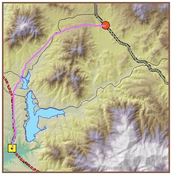
The primary goal of this exercise is to find the least-cost path for a proposed power transmission line between a fictional power plant site (Otay Valley Power Plant) and substation (Jamul Substation) in Southern California. You must balance two important considerations: keeping construction costs down and minimizing risks to public safety.
Consider the following objectives:
The least-cost path should be primarily composed of land with shallow slope, because steep terrain will increase the cost of operating construction equipment.
On the other hand, the longer the path, the higher the construction costs; therefore, the distance between the two sites will also be considered.
You will consider the cost of construction through various land use types. In order to minimize costly delays, you will try to avoid construction in possibly contentious areas, such as residential locations, commercial zones, and open space preserves.
For safety reasons, power lines should not be located near certain areas, like airports and lakes.
The process of preparing the total cost surface involves deriving surfaces from existing surfaces, and is typical of the work you can do with ArcGIS Spatial Analyst. The diagram below illustrates the entire process of finding the least-cost path.
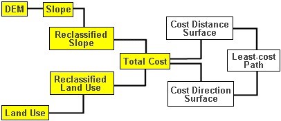
In this exercise, you will prepare the data for analysis. You will create a total cost layer by adding the slope and land use layers. Before you can add the slope and land use layers together, you will need to reclassify their value ranges to a common scale. In this case, you will use a scale of 1 to 10, where 1 indicates best and 10 indicates worst. Next, you will perform a cost-weighted analysis using the total cost layer that you created in the previous step. The cost-weighted analysis will result in two new surfaces: cost distance and cost direction. The cost distance surface will represent the aggregated cost of construction as you move farther away from the Otay Valley Power Plant site. The cost direction surface will depict opportunities and obstructions to the flow of cost-effective construction back to the power plant from any point in the study area.
You will then use the cost distance and cost direction layers as inputs for the least cost path analysis. When combined, these layers are like an obstacle course. The farther away you are, the more it costs you in time, money, or effort to reach the goal, but there are also barriers that prevent you from taking a straight line to the goal. The least-cost path analysis will find the most cost-effective path from the Jamul substation back to the Otay Valley Power Plant.
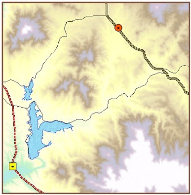
Step 1 Open a map project
If necessary, start ArcGIS Pro. Open the Disden.aprx project located in your Disden folder.
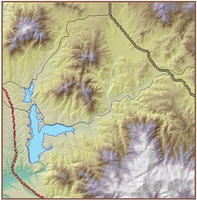
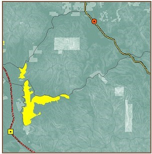
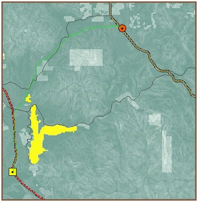
The dashed red line in the lower-left corner represents an existing power line.
Step 2 Determine source and destination
In order to determine an optimum path, you will need to identify two points: where the path will begin and where the path will end.
Turn on the Otay Valley Power Plant layer.
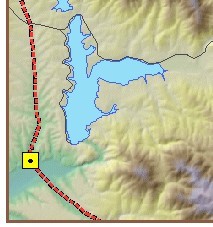
The Otay Valley Power Plant is where the path will begin—the source.
Turn on the Jamul Substation layer.
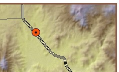
The Jamul Substation is where the path will end—the destination.
Step 3 Determine cost surface criteria
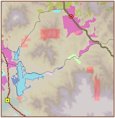
For this analysis, you will consider two factors that will impact the cost of constructing a power line between the Otay Valley Power Plant and the Jamul Substation: steepness of slope and type of land use. Turn off the Hillshade layer.
You will use the Power line DEM layer to create a slope layer. Turn on the Land use layer.
Step 3b: Determine cost surface criteria.
Due to differences in monitor settings and color defaults, the colors you see in the view result graphics may vary from your results.
In this analysis, the slope and land use data must be in raster format. These rasters are referred to as cost surfaces and are the ones you will add to create a total cost surface.
Cost surfaces are used to gage the expense of travel across a surface. Time, money, effort, and speed are examples of travel expense. In this case, a wildlife preserve composed of steep slopes would be a more costly place to construct a power line than vacant land with shallow slope.
Step 4 Set the analysis environment
Set the analysis environment as follows:
Set the current workspace to Disden\MyData
Analysis extent: Same as Layer “Study area”
Analysis cell size: Same as Layer “Power line DEM”
Analysis mask: <None>
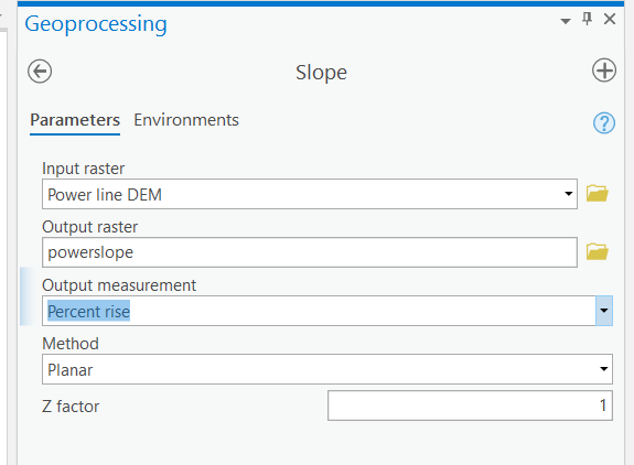
Step 5 Create a slope map
First, you need to derive a slope map from the digital elevation model (DEM).
From the Spatial Analyst Tools menu, choose Surface Analysis, then click Slope. Or just search the Slope tool. For the Input surface, click Power line DEM. For Output raster, navigate to Disden\MyData folder. Name the raster Powerslope. Click the down arrow next to Output measurement and chose Percent_Rise. Accept the default value for Z factor. Click OK.
For Output raster, navigate to your Disden\MyData folder. Name the raster Powerslope.
The result looks like this.
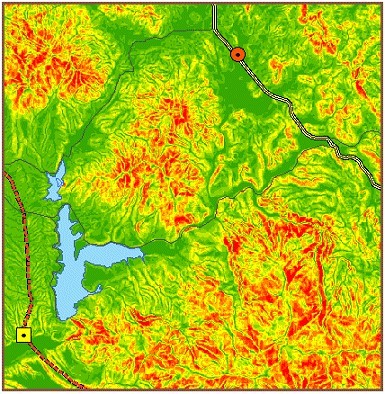
Step 6 Reclassify slope
For this analysis, you will assume that steeper slopes add to construction costs, and you will reclassify the slope layer accordingly. Take a look at the slope range of the Powerslope layer in the Table of Contents.
From the Spatial Analyst toolbox, choose Reclass - Reclassify. Click the Input raster dropdown arrow and choose Powerslope.
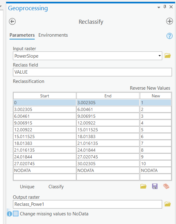
Click Classify. Choose 10 for the number of classes.
Name the output raster ReclassPS.
Change the ReclassPS symbology.
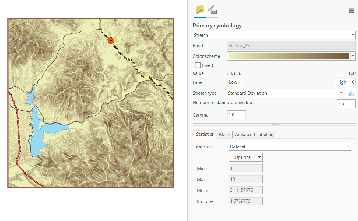
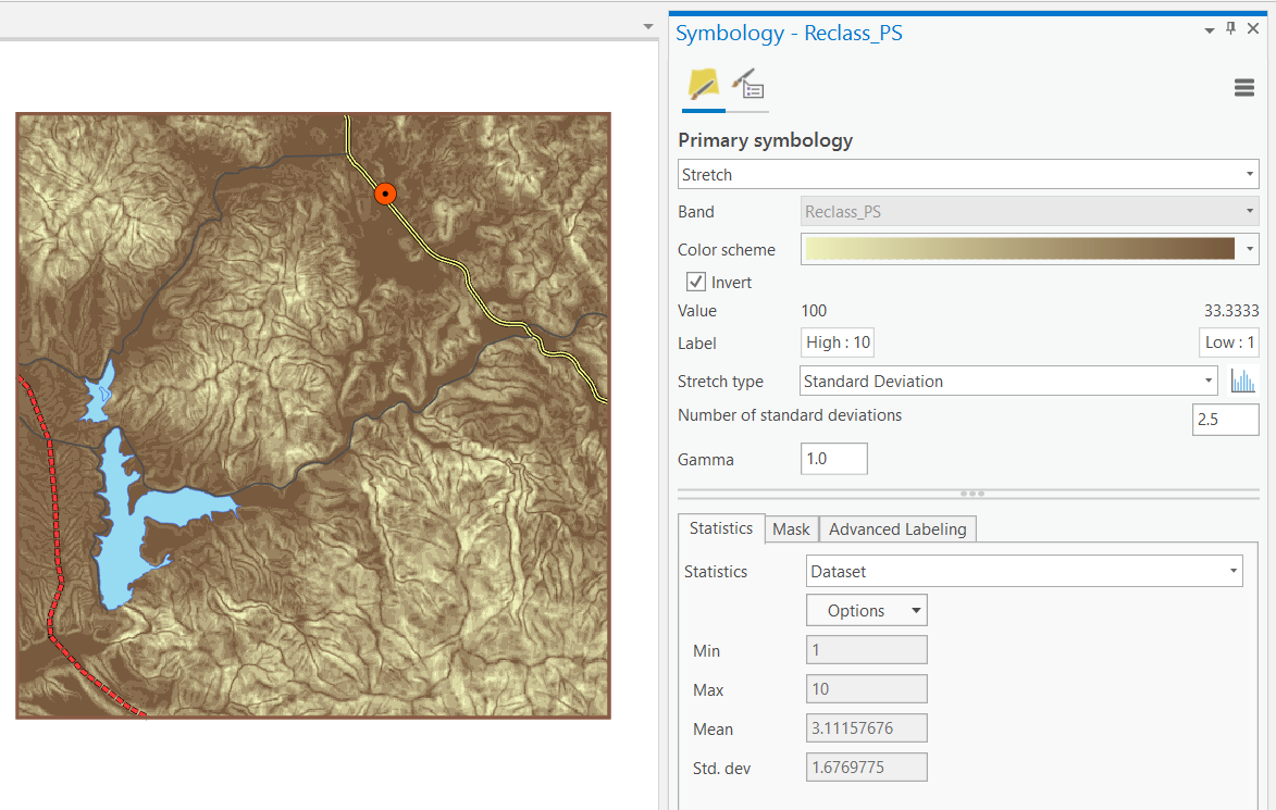
The darker shades represent areas of shallow slope—areas where construction costs will be less expensive.
Step 7 Reclassify the land use layer
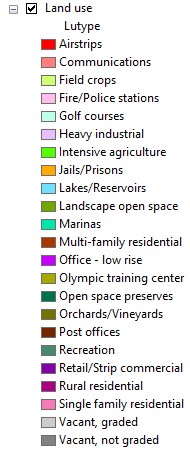
In the Table of Contents, expand the Land use layer (Lutypes may be symbolized differently).
Step 7a: Reclassify the land use layer.
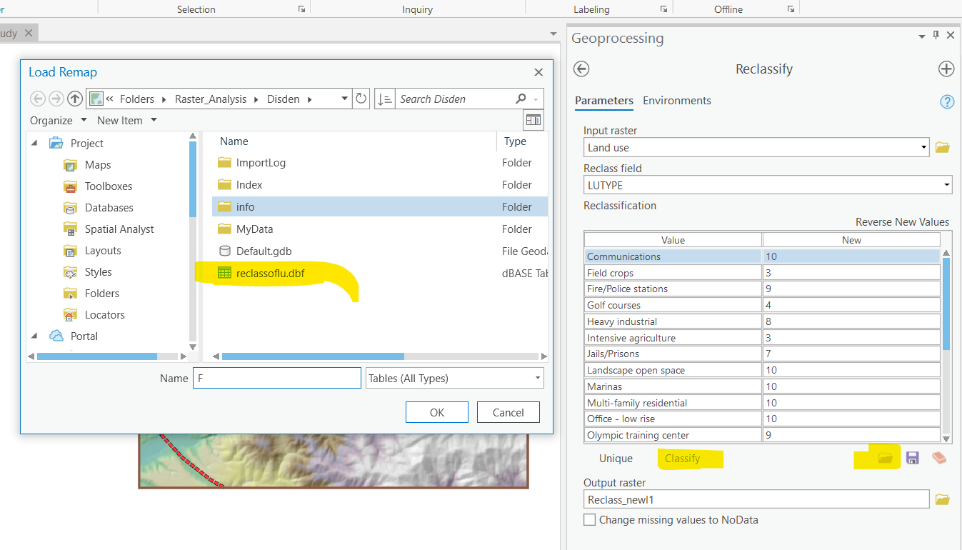
From the Spatial Analyst menu, choose Reclassify. Click the Input raster dropdown arrow and choose Land use.
Remember that the reclassification for Slope was straightforward because the slope layer is continuous data. Reclass values of 1 corresponded to the lowest slopes, 2 to the next lowest, and so on.
The data for the land use layer is not continuous, it is discrete. A classification scheme where 1 corresponds to airstrips, 2 corresponds to communications, and so on, does not correspond at all to the relative suitability of land use and the construction of powerlines; so, you have to add your own suitability reclass table, which has already been created for you.
In the Reclassify dialog you have open, click Load.
Navigate to your Disden folder, select reclassoflu, and click Load.
Scroll through the list to see how different land use types have been ranked.
Locations such as Single family residential and Open space preserves have been ranked as most costprohibitive. Vacant land and agricultural areas have been given a lower cost ranking.
Notice that the land use values for Lakes/Reservoirs and Airstrips are missing from the list. Remember, the powerline path should not go across water or airstrips under any circumstances. While giving these features a high reclass value, such as 10, would likely prevent the path from doing this, you don’t want to take any chances. Instead, you will change the values representing water and airstrips to NoData because Spatial Analyst will not allow the path to go through NoData cells. Check the Change missing values to NoData box.
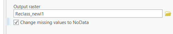
Locations of NoData will not be considered in the analysis.
Remember, the powerline path should not go across water or airstrips under any circumstances. While giving these features a high reclass value, such as 10, would likely prevent the path from doing this, you don’t want to take any chances. Instead, you will change the values representing water and airstrips to NoData because Spatial Analyst will not allow the path to go through NoData cells. (Note: Values may be symbolized differently.)
Step 8 Create a total cost layer
In this step, you will create a total cost layer by combining the common scale values for the ReclassPS and ReclassLU layers.
Areas of NoData in either of the input layers will be NoData in the total cost layer.
Open the Raster Calculator and build expression similar to this:
“reclassLU” + “ReclassPS”
Try to click on those layers and “+” to avoid typos. Click Run. (Note: Values may be symbolized differently.)
Step 8a: Create a total cost layer.
The resulting output layer is another surface with a value range of 3 to 19.
Open the Layer Properties dialog for the new output layer. Click the Symbology tab.
Click the Color scheme dropdown arrow and choose the dark green to light green color ramp. Hint: Use Stretched values.
Click the Display NoData as dropdown arrow and choose a bright yellow color, such as Solar Yellow. Click OK.
Turn off the Lakes layer.
The darker shades indicate areas through which it will be less costly to construct a power line.
The areas of NoData will not be considered in the analysis. Rename the total cost surface to Cost.
It is important to remember that a total cost layer, like the one you just created, may represent only one version of total costs. Typically, you might consider different combinations of contributing factors, thereby creating several total cost surface alternatives.
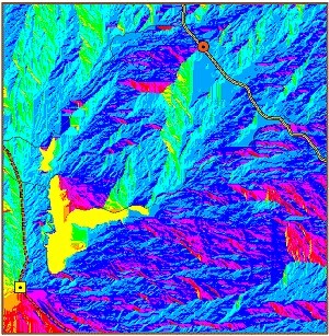
Step 9 Perform cost distance analysis
Before you find the least-cost path for a power line between the Otay Valley Power Plant and the Jamul substation, you must derive two surfaces from the total cost surface. (See the process diagram above.)
One surface model is increasing costs as you travel farther away from the source. The other surface model is increasing costs depending on the direction you are traveling. Both of these surfaces are used as inputs to calculate the least-cost path.
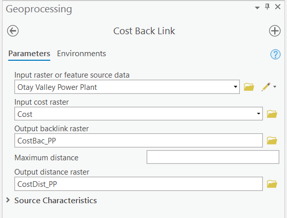
In this step, you’ll create the cost-distance and cost-direction layers that are the final inputs to the (least)-Cost Path analysis. First, however, we need to identify for each cell, which is the least cost neighbor. This is done with the Cost Back Link function.
From the Spatial Analyst menu, choose Distance, then choose Cost Back Link.
For Input raster or feature source data chose Otay Valley Power Plant.
For Input cost raster chose Cost.
Name the output backlink raster CostBackLink.
Leave the maximum distance field empty and name the Output distance raster CostDistance..
Click Run.
Now that we know in what direction the lowest cost neighbor lies, we can calculate a total (least) cost path.
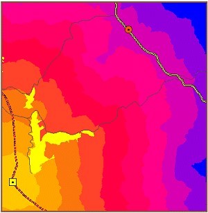
The CostBackLink to Otay Valley Power Plant layer also takes into account the total cost layer and determines the bearing to the easiest (least costly) path back to the Otay Valley Power Plant.
Step 10 Find the least-cost path
Now you are prepared to use the least-cost path function and find the least-cost path between the source point, Otay Valley Power Plant, and the destination point, Jumal Substation. Remember the two cost factors, slope and landuse, are not weighted, but assume equal influence.
From the Spatial Analyst menu, choose Distance, then click Cost Path.
For Path to, choose Jumal Substation.
For Cost distance raster, choose Distance.
For Cost direction raster, choose Direction.
For Path type, click the dropdown button and choose Best_Single.
Click the navigate button for Output features and navigate to your MyData folder.
Name the output LCpath, then click Save.
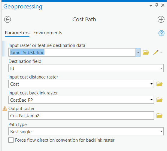
Click OK.
The resulting layer represents the least-cost path (avoiding steep slopes and costly land use types) between the Otay Valley Power Plant and the Jumal Substation. Notice the path follows an existing power line corridor and skirts the edges of a lake and open space preserve.
Rename the NewPath layer Least Cost Path.
This preliminary analysis illustrates other considerations you could incorporate into your least-cost path model. Perhaps, for example, sharing the existing power line corridor is not feasible, or you decide that the new power line must be at least 100 meters from any lake. These factors could be added to the total cost surface; then you would run the cost-weighted distance and shortest path functions again.
Step 11 Display the results
For now, you may want to share the least-cost path result with other people involved in the project before modifying the analysis.
Turn off all the layers except Least Cost Path, Study area, Jumal Substation, Otay Valley Power Plant, Roads, Lakes, Power line, and Power line DEM. Turn on the Hillshade layer.
To make the final line more visible, you can run “Expand” tool to make it wider. Also you can add labels to the plant and station.
Key points
Finding the shortest or least-cost path from one location to another requires the creation of a total cost surface. This can be a time-consuming process, depending on how many variables you decide to include in the analysis.
In a shortest or least-cost path analysis you must identify at least two points or locations: the source and the destination.
Before adding the cost surfaces together to create the total cost surface, you must reclassify each of them into a common scale.
NoData cells will be excluded from the shortest or least-cost path analysis.
Before you can run a shortest or least-cost path analysis, you must create a total cost surface. This is usually the most time-consuming portion of the process because you must determine the variables, put the layers together, and rank the values.
Before you can run a shortest or least-cost path analysis, you must run a cost weighted distance analysis on the total cost surface to create two surfaces: a cost distance surface and a cost direction surface.
A cost distance surface represents how costs accumulate as you move farther away from the source.
A cost direction surface determines the bearing to the easiest (least costly) location back to the source.
Export your final least-cost path map to a PNG file (>=300 dpi) and insert the file to the Word document.
III. Instructions and Tips
The assignment must be typed and prepared in word-processing software, as hand-written work will not be accepted. The assignment answer file must be submitted through CUNY/Hunter Blackboard. Do NOT zip your document, do NOT send email to submit answers, and do NOT submit your data unless being asked to do so. If you have trouble using Blackboard, please contact the Hunter Help Desk.
The following file naming rule is used for this assignment when you submit the answers.
GTECH_732_361_L02_CUNY_ID.doc|docx|txt
L02 means Lab 02. Do not omit the zero in the; otherwise, there would be file ordering problems on my end. Change the CUNY_ID (the [FirstName].[LastName][two digits]) to your owns.
Thank you!