Mapping proportion
You can map the relationship between two attributes by normalizing (dividing) one by the other to produce a ratio. As when mapping density, normalized data is typically symbolized using graduated colors or symbols.
|
Common reasons to map attribute
relationships |
|
|
What to map |
Example |
|
Proportion
of the part to the whole |
Countries:
Bushels of wheat exported normalized by bushels of wheat harvested |
|
Rate of
something |
Counties:
Cases of heart disease normalized by total population |
|
Relationship
of one characteristic to another |
Schools:
Number of students normalized by the number of teachers |
|
Relationship
of one time period to another |
Sales territories:
Last year's sales revenue normalized by this year's sales revenue |
Proportions
can be represented in a legend in a number of ways. Three common ways are to
use:
· Ratios, which range between 0 and 1
· Percentages (ratios multiplied by 100)
· Rates based on a round number, such
as per capita (per person), per 100, or per 1,000
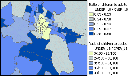
The ratio of children to adults is mapped by normalizing one attribute by another. Two alternative legends are shown: the top one uses ratios, while the bottom one uses rates.