Mapping density visually
Another way
to map density is to do so visually by using dots to represent quantities of
things in the real world. This kind of map is called a dot density map. Each
dot represents a specific count or amount. The more dots in an area, the
greater the quantity. The closer the dots are together, the greater the
density.
It's important to understand that ArcMap places the dots on a dot density map randomly within each polygon feature. Unlike symbols representing a point layer, the individual dots in a dot density map are not associated with actual location coordinates.
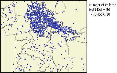
A dot density map provides a visual sense of the density of objects or quantities in the real world.