Deciding which classification scheme to use
When
mapping quantities, you may ask yourself:
· Which classification method should
I choose?
· How many classes should I have?
There are
no "correct" answers. The best classification scheme for a given map
layer depends on the purpose of the map, the characteristics of the data, and
cartographic considerations such as how easily the resulting map can be
understood.
One
approach is to let the data inform your decision. When you are looking for
patterns in your data, you could try different classification methods and
visually analyze the resulting maps, then select the method that seems best. To
evaluate classification schemes before you map them, you can use a graph that
ArcMap provides called a classification histogram.
The
classification histogram charts the number of attributes (features) for each
attribute value. The bottom axis shows the attribute values, and the side axis
shows the frequency of the values. The height of the gray bar indicates the
number of times a given value occurs in the table (its frequency) .
When deciding on the number of classes, there is one rule of thumb you can use: fewer is generally better. Three to seven classes is usually best.
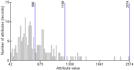
classification histogram helps you visualize how attribute values are distributed across the overall range of values. The blue lines show the current class breaks (the highest attribute value in each class). The data in this histogram is grouped into three classes.
Another
approach is to choose a classification scheme first, and let the attribute
values fall where they may. There may be a scientific or statistical reason for
using a particular classification method with particular data. Or, you might
have predetermined standards or criteria that dictate the method or number of
classes.
The table below provides some general guidelines for choosing an appropriate classification scheme.
|
Classification method |
When to use |
How many classes to have |
|
Natural
breaks |
When
attributes are distributed unevenly across the overall range of values |
Choose a
number that best reflects the natural groups of attributes you want to show. |
|
Equal
interval |
When you
want all classes to have the same range |
Choose a
number that produces an easily understood interval, such as 2, 50, 1000, etc.
Or, choose the number of classes that produces a map with your intended
message. |
|
Quantile |
When
attributes are distributed in a linear fashion (an even distribution across the
range of values and little variation in the number of attributes for each
value) |
Choose a
number that makes sense for the purpose of your map. |
|
Manual |
When you
want classes to break at specific values |
Choose
the number that makes sense with your classification scheme. For example, you
would need two classes to show values above and below a certain threshold
value. |