Drawing features to show quantities
Quantity attributes are always numeric. The numbers represent counts, amounts, rates, or measures.
|
Quantity Type |
Layer Name |
Attribute |
Attribute Values |
|
Count |
|||
|
|
Cities |
Population |
|
|
Amount |
|||
|
|
Sales territories |
Revenue (dollars) |
|
|
Rate |
|||
|
|
Counties |
Literacy rate (percent) |
|
|
Measurement |
|||
|
|
Wells |
Depth (meters) |
|
Feature quantities
are typically represented on a map by creating groups of features with similar
values (classes) and assigning a different symbol to each class. However, even
though the symbols are different, they usually change gradually from one class
to another, forming a series. Graduated size and graduated color are the two
most common ways to symbolize quantities.
Drawing features using symbols in a graduated series permits map readers to visualize geographic distribution patterns in quantity data. For example, if a map is drawn with colors ranging from yellow to orange to red, red areas can quickly be interpreted to represent greater values than yellow ones. Likewise, it is intuitive that smaller symbols represent smaller quantities than larger symbols.
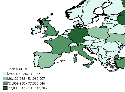
The countries in this map are displayed with graduated shades of green. The darker the shade, the greater the country's population
When choosing graduated colors, it is important to be aware of common color associations that people make. People will easily understand a temperature map drawn with blue symbols for cold and orange for warm; the same map symbolized the opposite way would be frequently misinterpreted.